Monthly Archives: March 2017

Community colleges and upward mobility

Below is a map identifying colleges operating in education deserts, or commuting zones where there are either: a) zero public colleges or b) a single community college is the only broad-access public option. This definition gives a useful but certainly not comprehensive view into communities around the country where prospective students’ choices are most constrained.

(Tableau page here)

But I do not believe that having fewer choices necessarily means students’ outcomes will be poor. It certainly may, but this is an empirical question that I don’t think has been closely examined. It turns out, I’m finding community colleges located in these deserts have higher than average mobility rates. And this is even after controlling for the local community zone mobility rate and a rich set of college-level covariates (including transfer-out graduation rates).

This is from my ongoing work for an upcoming conference at William & Mary on higher education and social mobility. For that conference, I’ll be presenting preliminary findings from what I’ve learned after merging IPEDS, Scorecard, and mobility report card data. I’m still sorting through it all, but it seems pretty consistent with Chetty et al’s findings that open-access colleges (especially when they’re the only public game in town) have high mobility rates.

I wanted to share this map to see if anybody notices anything strange. IPEDS and Scorecard don’t include satellite campuses and in some cases they merge campuses to central offices that may artificially result in a desert due to reporting issues. For example, Indiana’s Ivy Tech Community Colleges stopped reporting campus-level data in 2011 when they centralized their Program Participation Agreement, meaning it looks like the only Ivy Tech is in Indianapolis when we know they’re located all over the state. I’ve tried to adjust for some of the big problems like this one, but am still fine-tuning others (e.g., cleaning up some of the exclusively online colleges, etc.).

Feedback welcome!

March FAFSA deadlines – Part II

Each Friday, the US Department of Education publishes FAFSA filing data for all high schools in the country. We have been using this data to examine trends in filing, both for prior cycles and the the current (2017-18) cycle.

Last Friday, we presented at the AEFP conference or working paper (here) on filing rates and we thought it would be fun to throw in a slide on the new data that was released earlier that morning. We wanted to do that because it was the first look at filing since the IRS and Department of Education suspended the Data Retrieval Tool (DRT) on March 3rd. This tool made it easier for filers to import their tax records, which in turn should help students complete the form and reduce the need for verification.

In that presentation we shared the following slide, saying the dip corresponded with the DRT suspension.

In our discussion and in the following conversations, we pointed out that some states have March deadlines that could be behind the spike and drop we see here. Attendees at the session also noted that the drop could simply be a result of secular trends, rather than the tool being unavailable. This is what we loved so much about the conference — we could puzzle together on an ongoing policy issue and we could discuss appropriate research designs for disentangling secular trends from the “treatment” effect.

I am still in conference mode, so I was eager to follow up on this when I returned home. Here is a quick look at those secular trends comparing states with early March deadlines (CA, ID, IN, MD, MI, OR, WV) to all other states.

This chart is a little hard to read, but the left shows last year’s cycle and the right is this year’s. We’re looking at the week-to-week percentage point change in FAFSA completions among high school seniors.

The dotted line represents states with early March filing dates, and sure enough we see the early-March spike in both cycles. And, as expected, we don’t see that spike in other states.

But notice one thing: the weekly trends show much steeper changes than this year’s cycle. This is because last year was much more condensed and this year is spread out over three additional months.

The March spike last year went from 21% to 36%, a 14 percentage point bump in a single week! This year, the bump is much smaller, but it is still large relative to other weeks: a 9 ppt bump.

I wanted to show these big picture trends just to get the complete cycle in our minds. But this is hard to see in the above chart, so let’s zoom in.

We see the steep weekly declines in the 2016-17 cycle, where “early March” states basically flat-line by the end of the month. And the other states slow down to about 5 percent growth rates through April.

In the 2017-18 cycle, we still see that spike and we can anticipate the “early March” states will flat-line in the coming weeks. But it looks like the weekly trend holds pretty steady from week to week, hovering around 4 percent until February when it dips down to 2 percent.

[Side note: Look at the holiday season dip here, where filing drops in December. It does the same around Thanksgiving in the other chart above.]

The DRT suspension occurred on March 3rd, which likely had little to no effect on “early March” states so long as their deadlines were on March 1 or 2. But in the other states, we see March 10 (the week following the DRT suspension) reach its lowest point all cycle. The growth rate drops to 1.6% and we will monitor whether it rebounds in the coming weeks.

Considering that 1.78 million high school filers completed by June 30 last year, we have a long way to go to beat that level. We are currently at 1.62 million completions. That’s 160,000 a student gap that needs to be filled in 15 weeks. We can get there with a weekly growth rate less than 1 percent. We are already far above where we were last year in terms of completions, and I doubt weekly growth rates will slow below 1 percent. But this needs monitoring to be sure we’re on pace.

Whether the dip we saw this week was just part of the secular trend or whether it was because of the DRT suspension, we cannot say for sure with this descriptive analysis. We just wanted to share the data and bring this into the conversation. We don’t want to add noise or confusion to that conversation and we want to point out that it is hard to disentangle secular trends from the “treatment” effect. And that’s precisely why AEFP is a good conference to visit in order to share preliminary findings and to work through questions together.

We’ll keep monitoring this and piecing together as best of a picture as we can. Feedback welcome, as always!

Data:

Early March states Not early March states
Completed Submitted Completed Submitted
2016-17 cycle
January 8, 2016 30,515 36,605 104,872 125,304
January 15, 2016 54,412 64,185 185,193 216,134
January 22, 2016 77,754 91,606 257,083 299,213
January 29, 2016 104,997 123,217 339,954 392,649
February 5, 2016 139,918 163,356 451,996 518,168
February 12, 2016 167,847 194,819 544,011 618,187
February 19, 2016 202,543 234,077 650,209 736,784
February 26, 2016 244,641 280,501 745,762 837,536
March 4, 2016 332,235 383,092 865,845 967,066
March 11, 2016 351,423 402,080 918,114 1,020,316
March 18, 2016 362,821 412,751 969,787 1,074,355
March 25, 2016 370,270 416,572 1,010,295 1,110,564
April 1, 2016 374,809 420,089 1,051,186 1,152,268
2017-18 cycle
October 7, 2016 36,760 41,943 159,976 180,256
October 14, 2016 63,726 71,756 264,881 293,808
October 21, 2016 89,957 101,377 359,001 396,507
October 28, 2016 115,443 129,415 448,117 492,713
November 4, 2016 139,479 155,856 533,215 584,646
November 11, 2016 154,773 172,794 586,070 641,763
November 18, 2016 177,266 197,186 665,354 726,252
November 25, 2016 186,013 206,853 696,765 759,629
December 2, 2016 207,066 229,919 769,497 837,037
December 9, 2016 216,850 240,117 806,861 875,767
December 16, 2016 225,690 249,402 841,780 912,144
December 23, 2016 231,912 255,948 867,412 939,113
December 30, 2016 238,191 262,747 892,013 965,228
January 6, 2017 247,790 273,030 930,049 1,006,055
January 13, 2017 256,997 282,662 966,455 1,045,077
January 20, 2017 267,939 294,030 1,008,471 1,090,663
January 27, 2017 279,177 305,858 1,044,504 1,127,559
February 3, 2017 292,968 320,433 1,089,586 1,175,960
February 10, 2017 303,994 332,054 1,118,125 1,204,642
February 17, 2017 317,077 346,011 1,147,851 1,235,870
February 24, 2017 331,670 361,602 1,173,191 1,262,285
March 3, 2017 379,359 419,348 1,210,582 1,302,398
March 10, 2017 392,864 430,926 1,229,581 1,320,855


March FAFSA deadlines

A handful of state financial aid programs have early-March FAFSA filing deadlines, including some popular ones like California’s Cal Grant and West Virginia’s PROMISE scholarship.

Still other states (like Indiana and Texas) have mid-March deadlines that are now being pushed back to April due to the Data Retrieval Tool suspension.

Now that we have high school FAFSA filing data up to March 3rd from the Office of Federal Student Aid, we can see how filing spikes in the week(s) leading up to the deadline.

In California, about 201,000 high school seniors filed before the March 2nd deadline last year. But this year, that number is up about 10% and just shy of 224,000:

We see a similar spike in West Virginia, where FAFSA completions jump in the week or two prior to the deadline. Last year, about 8,300 high school seniors applied by the deadline and this year that number rose to almost 9,500 (a 13% jump).

Indiana’s original deadline was March 15th, and we can anticipate a similar jump prior to the deadline. Last year, they had about 27,000 completions going into March and this spiked up to 37,500 after the deadline, which is about a 40% spike in volume over the course of two weeks. But with the DRT suspension, there’s a good chance this jump is stunted, we will see tomorrow. And kudos to Indiana for extending the deadline to April 15!

I am not quite sure how to make sense of Texas (said every non-Texan ever). But right from the start of the new filing cycle, Texas high school seniors completed a large number of FAFSAs during the fall. Even though their state’s deadline is March 15, more students filed by February this year than the total number of filers by April of last year. Way to go, Texas! Maybe Texas is just different, but it makes me think deadlines may not always be associated with spikes. I’m sure there’s a lot of nuance I’m missing here, but this one really intrigues me compared to the prior few states.

We’ll continue to monitor the post-DRT trend, where we will likely shift away from total completions and focus on the percent of submissions that were completed. I can imagine there were spikes in submissions, but flat lines for completions in the week after March 3rd (when the DRT went down).

A closer look at WI’s proposed PBF metrics and rankings

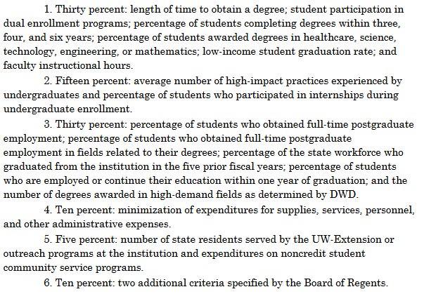
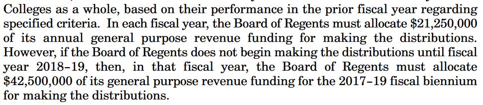
Governor Walker’s budget proposal would create a performance-based funding (PBF) system to allocate the $42.5 million in new money proposed for the 2017-19 biennium. There are six broad funding categories that generate 18 different metrics, depending how you want to count them:

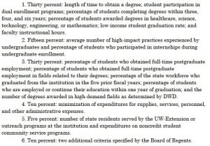
Only 5 of these 18 metrics are currently available in the University of Wisconsin System Accountability Dashboard:

  1. Length of time to obtain a degree
  2. Percentage of students completing degrees (within four and six years)
  3. Percentage of students awarded degrees in healthcare & STEM
  4. Low-income student graduation rate
  5. Percentage of students who participated in internships

The remaining 13 metrics are either unavailable in the Dashboard, or they are “almost” there. By “almost,” I mean there’s an alternative measure that is not quite the same as what is defined in the budget proposal.

Table 1: Mapping PBF indicators to Accountability Dashboard

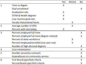
Using data from the Accountability Dashboard, I ranked each campus according to the five indicators in the “yes” column. Below is a summary of those results, showing the average rank across these five indicators.

Figure 1: Average rank on five key performance indicators

Across these five indicators, UW-Madison ranked at the top with an average rank of 1.5. Meanwhile, UW-Parkside ranked last with an average rank of 11.9 on these five. Notably, these five indicators would distribute between 30 and 40 percent of the total PBF allocation. It is possible, but I think unlikely, that calculations based on the other metrics would reverse these rankings (e.g., Parkside finishing first and Madison last).

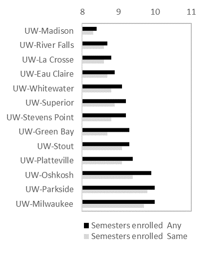
Metric #1: Time-to-degree

The Dashboard provides two ways to measure time-to-degree: credit hours attempted and semesters enrolled to graduation. In both cases, this metric follows cohorts of first-time, full-time students from the time they enter a UW System institution until graduation (in 2015-16). Not all students stay at the same college for their entire academic career, so this data is broken down for those who stay at the “same” college and those who ended up at “any” UW System university.

Figure 2: Credit hours attempted [left] and semesters to degree [right]


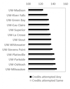
In each case, UW-Madison ranks first and UW-Milwaukee/UW-Parkside last. The choice of metric will matter in many cases. For example, UW-LaCrosse and UW-River Falls will tie if the Regents choose to use “semesters enrolled at the same institution,” but River Falls will rank higher than LaCrosse if completion at any campus is chosen. It is best to use “any institution” on this metric, given the magnitude of swirling and transferring that takes place in (and is encouraged by) systems of higher education.

Metric #2: Graduation rates

This metric follows each cohort of first-time, full-time students who begin college in a given academic year. Unlike the previous metric, this does not follow students who graduate from the “same” or from “any” UW institution. Instead, it only reports those who finish (within four or six years) at the same college where they began.

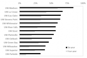
This metric is known as the Student Right to Know graduation rate metric, which under-counts the true graduation rate of public four-year universities by about 10 percentage points. Failing to account for transfer students or those who may were not first-time/full-time will play to the advantage of institutions enrolling “traditional” students (like UW-Madison). Adjusting this metric for open-access colleges and those serving post-traditional students would result in different and more accurate results that, in turn, will change the rank ordering.

Also note, the budget proposal calls for using three-year graduation rates, but this data is not reported in the Accountability Dashboard.

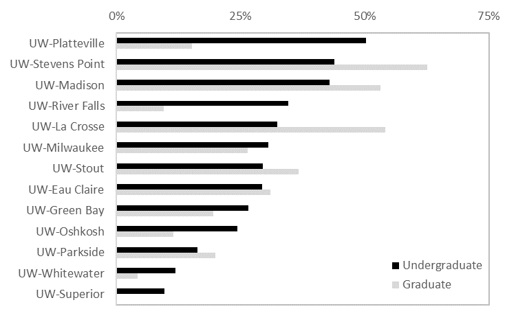
Metric #3: Share of degrees in Healthcare & STEM

This metric is a bit more complicated than I initially expected. The budget proposal does not differentiate between undergraduate and graduate students, though the Dashboard does (fortunately). Similarly, it is unclear whether “STEM” should be measured separately from “Healthcare” — or whether they should be combined. For simplicity, I combined them below and differentiate between undergrad and grad:

If one were to rank colleges by undergraduate Healthcare & STEM (combined), then Platteville and Stevens Point come in first and second, respectively. But if it includes graduate students, then UW-Madison would take third  and UW-LaCrosse second. It will be important for policymakers to clarify this metric since it is clear from the chart that rank orders will bounce around considerably depending on how this is measured.

Metric #4: Low-income student graduation rate

This metric is the same as Metric #2, but with an emphasis on Pell Grant recipients as the proxy for “low-income” (which is not without its own shortcomings). Nevertheless, using six-year graduation rates results in the same Top Four colleges as the other graduation rate metric. However, UW-Whitewater drops three places while UW-Platteville and UW-River Falls improve their rankings.

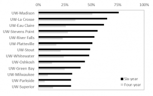
As a side note, I was impressed the Dashboard follows Pell graduation rates from the late 1970s, when the program was first created. This is a real treasure, as the federal government only recently began reporting Pell graduation rates in IPEDS. Kudos to the System data folks!

Metric #5: Percent doing internships

This metric is based on self-reported data from the National Survey of Student Engagement (NSSE). Here, UW-Platteville takes first place with having the highest share of seniors reporting they participated in an “internship or field experience.”

Technically, NSSE asks if students “participate in an internship, co-op, field experience, student teaching, or clinical placement.” And respondents can choose one of four options: done/in progress; plan to do; do not plan to do; or have not decided.

NSSE is not designed to be used in high-stakes accountability regimes like PBF. The main reason is that most of the variation in student responses occurs within (rather than between) campuses. Because of this, NSSE results are more useful for internal assessment and planning purposes and not for ranking colleges.

Other metrics not discussed here

There are 13 other metrics either not reported or “almost” reported in the Accountability Dashboard. In a future post, I’ll take a crack at the “almost” reported figures. For example, faculty instruction is reported in the Dashboard, but it only includes UW-Madison and UW-Milwaukee and then lumps together all other campuses in the system into a single “comprehensive” institution. Similarly, the average number of High Impact Practices (HIPs) is unavailable, but we can get the percentage of NSSE respondents experiencing at least one HIP. The percentage of Wisconsin’s workforce who graduated from a UW campus in the last five years (also an Act 55 reporting requirement) requires us to know the right denominator. But the Dashboard doesn’t tell us this: it only tells us the share of bachelor’s degree recipients living in the state (e.g., what if an alumni is out of the labor force; what age groups should be included; etc.?). Finally, it may be possible to use campus surveys to calculate the share of alumni working or continuing their education, but ideally this and several of the other workforce indicators would be answered via student unit record database rather than self-reported figures.

What’s next?

If approved in its current form, the Board of Regents would use these metrics to allocate PBF funds to campuses. The Board of Regents would also need to propose to the Department of Administration a plan for allocating PBF funds based on the rankings. For example, the plan would spell out exactly how much funding a campus will receive for getting 1st place on a particular metric…and how much (if any) will be allocated for those in last place.

The Regents need to figure this out and submit their plan to the Department of Administration by January 1, 2018, or in about 300 days from today. This obviously eats into the upcoming fiscal year, meaning all $42.5 million will be disbursed via PBF in 2018-19 (rather than $21.25 per year):