Author Archives: nwhillman

Building a county-level labor force and unemployment panel

If you have ever looked for a way to get county-level unemployment rates for each county over time, there are probably a few ways to go about that task. Below is one way to do it in Stata.

This copies each file from 2000 through 2018, saves and cleans it to your local machine, and then stacks them all together in a panel format. I haven’t fully spot-checked, so please let me know if you see bugs.

Disclaimer: I have never figured out the whole Git Hub thing. I suspect if you’re reading this page there’s a good chance you haven’t either. So please don’t proselytize, just use this as a resource. WordPress doesn’t allow uploading .do files, but here’s what’s you could do:

// set local directory
cd C:\Users\BLS_LAUS

// copy data (2000 to 2018) from BLS website
local years 00 01 02 03 04 05 06 07 08 09 10 11 12 13 14 15 16 17 18
foreach y of local years {
import excel https://www.bls.gov/lau/laucnty`y’.xlsx
keep if substr(A, 1, 2) == “CN”
rename A laus_code
rename B state_fips
rename C county_fips_3
rename D county_name
rename E year
drop F
rename G labor_force
rename H employed
rename I unemployed
rename J unemp_rate
replace labor_force = “” if labor_force==”N.A.”
replace employed = “” if employed == “N.A.”
replace unemployed = “” if unemployed==”N.A.”
replace unemp_rate = “” if unemp_rate == “N.A.”
destring year-unemp_rate, replace
generate str county_fips = state_fips + county_fips_3
save county_20`y’.dta, replace
clear
}

// append each year starting with 2000
use county_2000.dta
forvalues y=2001/2018 {
append using county_`y’.dta
}
save county_panel_2000_2018.dta, replace

// table of total labor force, employed, and unemployed
table year, c(sum labor_force sum employed sum unemployed) f(%20.0fc)


State support for public higher education – trends and data

Here is a quick visualization of the relationship between state higher education appropriations and net tuition revenue per full-time equivalent student from fiscal year 1980 to 2018.

The y-axis represents inflation-adjusted dollars per FTE based on SHEEO’s State Higher Education Finance data (here). The x-axis represents fiscal years; the solid black line is net tuition; the dotted line represents appropriations.

Please use, copy, and improve upon the Stata code pasted below to replicate these charts. This type of chart is a bit overwhelming, probably too much to squeeze into a small space, but it helps me see trends across multiple states. For example, I am squinting at the steady downward appropriation trends in Wisconsin that seems to have flattened out or even reversed direction in other Midwestern states over the past several years.

Thanks to the SHEEO team for making this data so easy to use. Stata code below:

// import data from SHEEO SHEF page
import excel https://sheeo.org/wp-content/uploads/2019/04/SHEEO_SHEF_FY18_Nominal_Data.xlsx, cellrange(A17:Q2016)

// trim data to focus on public appropriations, net tuition, and fte
keep A B E L N Q
rename A state
rename B fy
rename E heca_index
rename L ed_approp    // state and local support less RAM
rename N net_tuition   // net tuition less federal and state grants
rename Q fte                 // fte net medical students

// adjust for inflation using HECA
gen approp_adj = ed_approp / (heca_index/1)
gen tuit_adj = net_tuition / (heca_index/1)

// scale per fte
gen approp_fte = approp_adj/fte
gen tuit_fte = tuit_adj/fte

// table over time
table fy if state~=”US”, c(sum approp_adj sum tuit_adj sum fte) format(%15.0fc)
drop if inlist(state,”US”,”Washington DC”)

// lattice charts
* rescaled y axis
xtline tuit_fte approp_fte, i(state) t(fy) scheme(s1mono) byopts(rows(5) rescale note(“”)) xlabel(1980[10]2020,angle(vertical)) xtitle(“”) ymtick(none) ylabel(, nogrid angle(horizontal)) legend(size(tiny) region(lwidth(none)) label(1 “Tuition”) label(2 “Appropriations”) symxsize(6))
* fixed y axis
xtline tuit_fte approp_fte, i(state) t(fy) scheme(s1mono) byopts(rows(5) note(“”)) xlabel(1980[10]2020,angle(vertical)) xtitle(“”) ymtick(none) ylabel(0[5000]25000,nogrid angle(horizontal)) legend(size(tiny) region(lwidth(none)) label(1 “Tuition”) label(2 “Appropriations”) symxsize(6))


Using difference-in-differences in higher education research

Difference-in-differences is gaining popularity in higher education policy research and for good reason. Under certain conditions, it can help us evaluate the effectiveness of policy changes.

The basic idea is that two groups were following similar trend lines for a period of time. But eventually, one group gets exposed to a new policy (the treatment) while the other group does not (the comparison). This change essentially splits time in two, where the treatment group’s exposure to the policy puts them on a new trend line. Had the policy never been adopted, the two groups would have continued on similar paths.

I made a data file and show the steps I took to conduct this analysis in Stata.

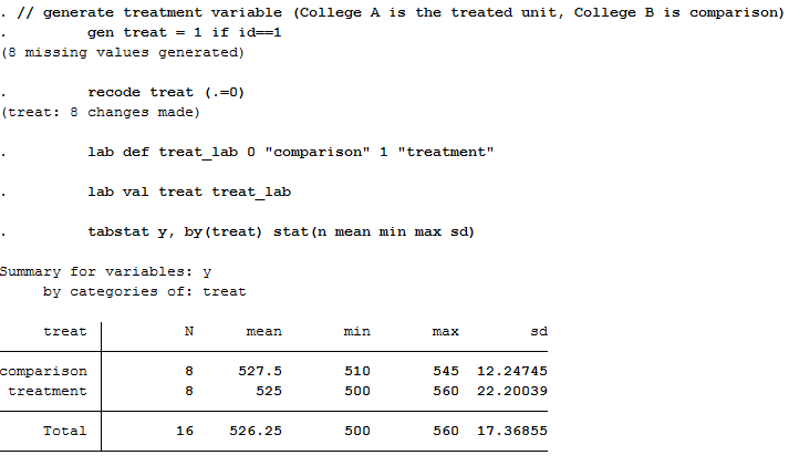
Step 1: Generate treatment variable

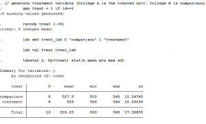
Let’s say College A is exposed to the policy change (treatment) and College B is not (comparison). We just need a simple dummy variable to categorize these two groups. Let’s call it “treat,” where College A gets a value of 1 and College B gets a value of 0.

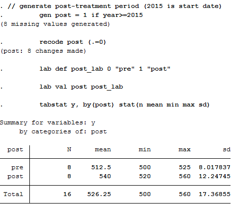
Step 2: Generate “post” policy variable

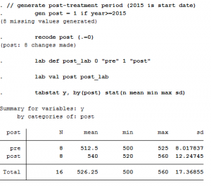
In the previous step, we didn’t say when the policy change occurred, so we need to do that now. Let’s say it began in 2015, meaning all years from that point forward are “post-policy” while those prior are “pre-policy.”

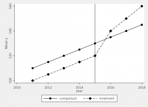
Step 3: Examine trends for the two groups

Now that we’ve identified the treatment/control and the pre/post periods, we can put it all together in a simple graph. I like to use the user-written “lgraph” command (use “ssc install lgraph, replace” to get it).

We see here the two groups were following similar trends prior to the 2015 policy change, and then the treatment group started to increase at a higher rate while the comparison group did not.

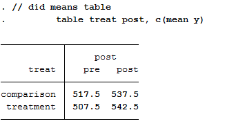
Step 4: Difference-in-differences means table

The visual inspection looks like there’s probably a policy effect, but it’s hard to tell the magnitude. To get at that, we need to measure the difference in groups means before and after the policy:

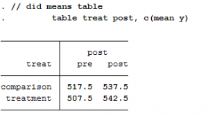
Below is a simple table calculating the difference between the two groups before (-10) and after (5) the policy. It then calculates the difference before and after within each group (20 and 35, respectively).

Pre Post Difference
Comparison 517.5 537.5 20
Treatment 507.5 542.5 35
Difference -10 5 15

The comparison group increased by 20 units after the policy, while the treatment increased by 35. Similarly, the treatment group was 10 units lower than the comparison group prior to the policy, but was ahead by 5 units after. When we calculate the difference in the group differences, we get 15 (e.g., 35 minus 20, or 5 minus -10).

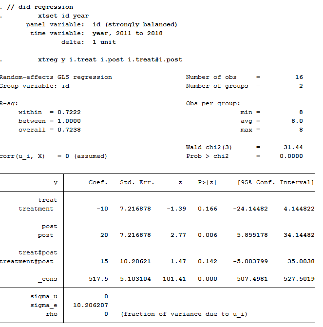
Step 5: Difference-in-differences regression

We can run a regression on the data using the two variables created in Steps 1 and 2. The only trick is we need to interact those two variables (treat x post) to get our difference-in-differences estimate.

Here, the “treat” dummy measures the treatment group’s pre-policy difference from the comparison group. And “post” is the comparison groups post-policy change. The interaction between the two variables (“treat x post”) is our average treatment effect of 15, the same number we saw in the previous step. The intercept is the comparison group’s pre-policy mean.

In a regression framework, we can easily add covariates, use multiple comparison groups for robustness checks, and address issues that may arise with respect to standard errors. Doing so can help rule out plausible alternative explanations to the findings, assuming other important considerations are also met.

My goal with this post was to break down the difference-in-differences approach to help make it a little more accessible and less intimidating to researchers/policy analysts. I am still leaning a lot about the technique, so please consider these steps some illustrative tips to get oriented/introduced.

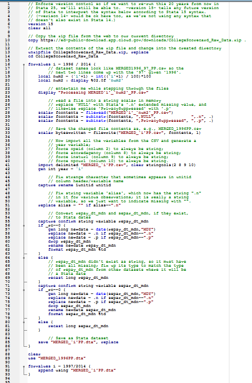
Stata replication code:

// generate treatment variable (College A is the treated unit, College B is comparison)
gen treat = 1 if id==1
recode treat (.=0)
lab def treat_lab 0 “comparison” 1 “treatment”
lab val treat treat_lab
tabstat y, by(treat) stat(n mean min max sd)

// generate post-treatment period (2015 is start date)
gen post = 1 if year>=2015
recode post (.=0)
lab def post_lab 0 “pre” 1 “post”
lab val post post_lab
tabstat y, by(post) stat(n mean min max sd)

// descriptives of the two groups
table year treat, c(mean y)
ssc install lgraph, replace
lgraph y year, by(treat) stat(mean) xline(2015) ylab(, nogrid) scheme(s2mono)

// did means table
table treat post, c(mean y)

// did regression
xtset id year
xtreg y i.treat i.post i.treat#i.post

State higher education funding – motion charts

Each year, State Higher Education Executive Officers (SHEEO) produces the go-to guide for state-level trends in higher education finance, downloadable and interactive data here.

Using this data, I created the following motion chart where each bubble represents a state. Pressing the play button shows how appropriations (x-axis) and net tuition revenue (y-axis) change over time.

You can select individual states and change the bubble color/size. All financial data are presented in 2017 dollars based on CPI and the “tuition-to-appropriations” ratio is simply that: net tuition relative to net appropriations, where values over 1 indicate the state generates more revenue from tuition than it appropriates. For more details on the data, see their report.

I hope you find this tool helpful! I like using it as a teaching tool, so please feel free to use and share. I sometimes run into trouble depending on the browser I’m using, so just a heads-up on that front. Unfortunately, Google retired Motion Charts, but I was able to update this with the most recent data so hopefully it has some shelf life.

Please let me know if you see any bugs or if you find interesting patterns!

High school FAFSA filing update

In the first three months of the current (2018-19) FAFSA filing cycle, 1.275 million high school seniors completed the form. This is a 6% increase from last year, as shown in the chart below.

We monitored these weekly trends last year and found about 2.1 million high school seniors filed by the end of the school year. So within just the first three months of the new cycle, we are over half-way to last year’s filing levels.

These trends hold pretty steady across the states, where all but five (MT, OR, VT, WV, WY) are outpacing last year’s figures each week.

Several states are making really strong progress on high school FAFSA completions over last year’s cycle. Arizona, Kansas, Louisiana, Mississippi, and Washington, DC, stand out as having some of the highest growth rates over last year.

We will continue monitoring these trends, especially in early spring when some state aid programs have filing deadlines.

Below is an excel file behind these charts, listing the weekly number of completions for the two cycles, by each state.

State high school FAFSA completions (.xlsx): state_hs_fafsa_week_13


Enrollment trends in UW Colleges

The UW Colleges are a unique feature of the public higher education landscape. They are classified as “Associate’s: High-Transfer, High-Traditional” colleges, meaning they largely serve traditional-aged students (coming directly out of high school) with a goal of improving transfer from Associate’s to Bachelor’s degree programs.

Nationwide, there are about 160 of these colleges* and they enroll about 1.5 million undergraduates. Since the end of the Great Recession, enrollments have dropped and today’s enrollments are higher than the pre-Recession levels.^

Colleges located in Midwestern states are experiencing similar enrollment declines since 2010, and the following chart shows the four largest Midwestern Higher Education Compact states’ total enrollments for their “high-transfer, high-traditional” Associate’s degree granting colleges:

Using the UW System’s Accountability Dashboard, we can see how UW Colleges’ enrollment levels have changed relative to four-year universities in the system (this chart excludes UW-Madison and UW-Milwaukee). Approximately 12,000 students enrolled during the fall of 2016-17.**

UW Colleges enrolled approximately 7 percent of the system’s total undergraduates in 2016-17 and this share has hovered between 6 and 8 percent over time.

And a growing share of UW Colleges’ enrollments are from students who identify as Black, Hispanic, or Native American. Since 2010, the percentage of students classified into these three racial/ethnic groups has doubled within the UW Colleges.

As conversations about UW Colleges continue, it is also worth stating these two-year institutions serve different missions than the Wisconsin Technical College System (WTCS). To oversimplify the difference, technical colleges are focused more on vocational training while UW Colleges focuses more on transfer. Nevertheless, the final chart uses IPEDS enrollment data to summarize how enrollments in the technical colleges, university system, and UW Colleges have changed over time.

Notes:

* A “college” could include multiple campuses. For example, UW Colleges is reported as a single institution in IPEDS, but accounts for 13 campuses and an online presence.

^ In all charts, we would get slightly different enrollment trends when using 12-month headcounts from IPEDS, but I used fall enrollment (undergraduate total, degree-seeking and non-degree-seeking).

** Note the axis scale on the previous chart makes the recent enrollment drop look less steep and the prior (IPEDS) data only includes 2015 enrollment, not 2016.

Waffle chart in Excel

Below are two ways to display the same data.

The first is a trusty old pie chart.

The second is its cooler pastry cousin, the waffle chart.

These data are from IPEDS, just a quick count of public college undergraduates by their college’s selectivity.

We can see in both charts the majority enroll in open-access colleges. But the waffle is easier on the eye, I think.

Turns out, the choice between pies and waffles can be contentious.

If you’re like me, you probably want to use a waffle chart to display your data sometime.

You can make one of these in R using the “waffle” command…if you are familiar with that program. I, sheepishly, am not.

For those of us still in the old school, I made this waffle chart in Excel. Please feel free to use in your own work, but keep in mind this will only work for up to four slices of pie.

Download this Excel file: waffle template

Step one: Enter up to four category names in cells B3:B6

Step two: Enter percentages (high to low) in cells C3:C6. The template is just filling these with random numbers as a placeholder.

Step three: Choose which chart you like better, the square waffle or the rectangle waffle. Both charts link to the same data.

Note: You’ll see two other tabs in this file, “chart 1” and “chart 2,” which are the underlying formulas driving the chart. Just pretend they’re not there.

I created and modified this based on a helpful guide found here. If you end up using this file, please let me know if you detect any bugs. I think I’ve worked them out, but don’t hesitate to contact me if you see any or have suggestions.

Why we need comparison groups in PBF research

Tennessee began implementing performance-based funding in 2011 as part of its statewide effort to improve college completions. The figure below uses IPEDS completion data plotting the average number of bachelor’s degrees produced by each of the state’s 9 universities over time.

One could evaluate the policy by comparing outcomes in the pre-treatment years against those in the post-treatment years. Doing so would result in a statistically significant “impact,” where 320 more students graduated after the policy was in effect.

Pre Post Difference
Tennessee 1940 2260 320

This Interrupted Times Series approach was recently used in a report concluding that 380 more students (Table 24) graduated because of the policy. My IPEDS estimate and the one produced by the evaluation firm use different data, but are in the same ballpark.

Anyway, simply showing a slope changed after a certain point in time is not strong enough evidence to make causal claims. In very limited conditions can one make causal claims with this approach. But this is uncommon, making interrupted time series a pretty uncommon technique to see in policy research.

A better approach would add a comparison group (a la Comparative Interrupted Time Series or its extensions). If one were to do that, then they would compare trends in Tennessee to other universities in the U.S. The graph below does that just for illustrative purposes:

By adding a comparison group, we can see that the gains experienced in Tennessee were pretty much on par with trends occurring elsewhere in the U.S.:

Pre Post Difference
Tennessee 1940 2260 320
Other states 1612 1850 238
Difference 328 411 83

The difference-in-differences estimate, which is a more accurate measure of the policy’s impact, is 83. And if we run all this through a regression model, we can see if 83 is a significant difference between these groups.

It is not:

Using this more appropriate design would likely yield smaller impacts than those reported in the recent evaluation. And these small impacts likely wouldn’t be distinguishable from zero.

I wanted to share this brief back of the envelope illustration for two reasons. First, I am working on a project examining Tennessee’s PBF policy and the only “impact” we are seeing is in the community college sector (more certificates). We are not finding the same results in associate’s degree or bachelor’s degree production. Second, it gives me an opportunity to explain why research design matters in policy analysis. I don’t pretend to be a methodologist or economist; I am an applied education researcher trying my best to keep up with social science standards. Hopefully this quick post illustrates why that’s important.

June 30 FAFSA report

Below is a summary of high school FAFSA filing up to June 30 for the current and prior filing cycles.

June 30, 2016: 1,949,067
June 30, 2017: 2,128,524

This is a 9% boost in filing, or 179,457 more filers than last year!

You can download the raw data here or below.

We haven’t yet taken a close look at which high schools have shown the most growth, and I won’t pretend to know what these schools did to boost completions, but below is a quick look at the Top 20 in terms of largest raw number increase in FAFSAs. Way to go, Northside High School in Houston, TX, which saw the biggest jump in completions – going from 25 to 457!

State School Name City June 30 completions (16-17) June 30 completions (17-18) Change Percent Change
1 TX NORTHSIDE HIGH SCHOOL HOUSTON 25 457 432 1728%
2 PA PENN FOSTER HS SCRANTON 911 1213 302 33%
3 FL CYPRESS CREEK HIGH ORLANDO 295 499 204 69%
4 IL LINCOLN-WAY EAST HIGH SCHOOL FRANKFORT 327 529 202 62%
5 FL TIMBER CREEK HIGH ORLANDO 396 572 176 44%
6 TX ALLEN H S ALLEN 674 842 168 25%
7 NC ROLESVILLE HIGH ROLESVILLE 95 258 163 172%
8 FL WILLIAM R BOONE HIGH ORLANDO 304 467 163 54%
9 CA WARREN HIGH DOWNEY 556 710 154 28%
10 CA RANCHO VERDE HIGH MORENO VALLEY 465 614 149 32%
11 IL JONES COLLEGE PREP HIGH SCHOOL CHICAGO 226 374 148 65%
12 FL OLYMPIA HIGH ORLANDO 318 460 142 45%
13 FL FREEDOM HIGH ORLANDO 374 515 141 38%
14 NY NEW UTRECHT HIGH SCHOOL BROOKLYN 372 511 139 37%
15 NY BRENTWOOD HIGH SCHOOL BRENTWOOD 491 630 139 28%
16 TX THE WOODLANDS H S THE WOODLANDS 419 555 136 32%
17 PA PHILADELPHIA PERFORMING ARTS CS PHILADELPHIA 7 142 135 1929%
18 TX LOS FRESNOS H S LOS FRESNOS 341 476 135 40%
19 UT COPPER HILLS HIGH WEST JORDAN 256 390 134 52%
20 CA VALENCIA HIGH VALENCIA 318 449 131 41%

And in Wisconsin, here’s a list of the Top 20 schools in terms of raw growth in completions:

State School Name City June 30 completions (16-17) June 30 completions (17-18) Change Percent Change
1 WI KING INTERNATIONAL MILWAUKEE 201 278 77 38%
2 WI BADGER HIGH LAKE GENEVA 148 217 69 47%
3 WI OCONOMOWOC HIGH OCONOMOWOC 194 262 68 35%
4 WI SUN PRAIRIE HIGH SUN PRAIRIE 238 306 68 29%
5 WI CASE HIGH RACINE 160 227 67 42%
6 WI EAST HIGH APPLETON 170 235 65 38%
7 WI REAGAN COLLEGE PREPARATORY HIGH MILWAUKEE 206 269 63 31%
8 WI RIVERSIDE HIGH MILWAUKEE 183 243 60 33%
9 WI MIDDLETON HIGH MIDDLETON 239 296 57 24%
10 WI DE PERE HIGH DE PERE 180 235 55 31%
11 WI BAY PORT HIGH GREEN BAY 232 281 49 21%
12 WI FRANKLIN HIGH FRANKLIN 229 277 48 21%
13 WI NORTH HIGH WAUKESHA 119 166 47 39%
14 WI HAMILTON HIGH MILWAUKEE 128 174 46 36%
15 WI EAST HIGH MADISON 173 218 45 26%
16 WI CENTRAL HIGH SALEM 134 178 44 33%
17 WI CENTRAL HIGH LA CROSSE 128 171 43 34%
18 WI MUSKEGO HIGH MUSKEGO 220 263 43 20%
19 WI WAUNAKEE HIGH WAUNAKEE 154 193 39 25%
20 WI WEST HIGH WAUKESHA 149 188 39 26%

We will continue to analyze this data and plan to merge with other data sources to gain a better understanding of the variation that exists in filing rates.

We want to be sure to make this data available along the way, so please feel free to download and use the following high school and state-level data comparing the two cycles: FAFSA completions to June 30.xlsx

I wish I had time and resources to make this data more user-friendly and to share more widely. But until then, hopefully this good old fashioned Excel file is of use!

More College Scorecard code for Stata

This post provides a new way to import and manage College Scorecard data in Stata.

Alan Riley, Stata’s VP for software development, created the following code that creates the same panel as described in my previous post.

But this one gets the job done in about 15 minutes!

Alan reached out after reading my previous post and seeing some of our Twitter conversation. He didn’t like hearing how long it took me (and others) to run this. So, Alan took it as a challenge to figure out a better way.

And that he did!

I asked if I could share this code here on my blog and he eagerly agreed. He offered one comment for users:

Just one caveat:

I feel that I just made some quick tweaks to the code, and there are probably not only more optimizations that could be found, but it could also be made more robust to potential problems with more use of Stata’s -confirm- and -assert- commands in various places to ensure everything is as expected.

Nick Cox (yes, the same Nick Cox from the Stata Forum) also reached out with some suggestions on the -destring- command I was previously using. I was destringing a lot of unnecessary items, which Alan fixed and greatly speeds up the process. Kevin Fosnacht offered all the labeling code in the previous post. And Daniel Klasik noted some quirks between Mac and PC users, where the “unitid” variable may create an error for Mac users. Thanks, guys!

And here is a .do file where I copied and pasted Alan’s original code (updated 11/14/2017): https://uwmadison.box.com/s/wo6dtfp141x103cen3uq2zr8s09av610